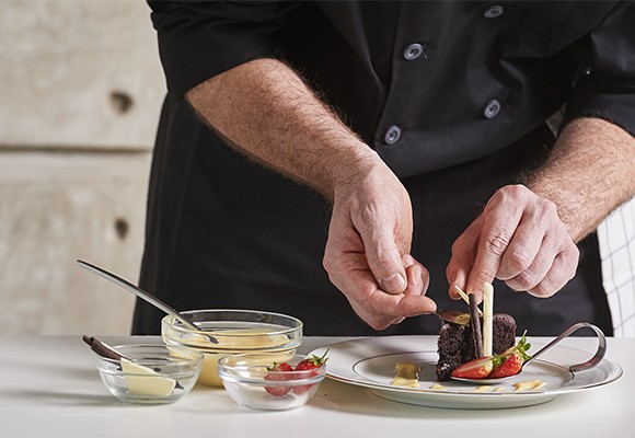
Creativity on a dish is an invitation for the senses. It is part of culinary enjoyment: it raises your expectations before taking choice morsels to your mouth. For me it is of the utmost importance when entertaining at home. Not only because of the distinct appearance of a well presented dish, but because your guests know there is a whole lot of love and dedication in the way food is laid out on the dish. In short, it is a gift.
In these short texts I have already shared with you some of my techniques for dressing the table or how to take snapshots in pure foodie style. Today I will write about the art of presenting food on dishes. How to make the white canvas of an empty plate into a beautiful and yet ephemeral work of art. The fact that it is short-lived adds to its charm.
COMPOSING AS A UNIT
The first of many tips: no matter how many different items are laid out on a dish, it has to be seen as one. How can we work on this unity? The foods must be cohesive. The different items must not get in each other’s way, but we must not leave blank spaces in the middle of the dish.
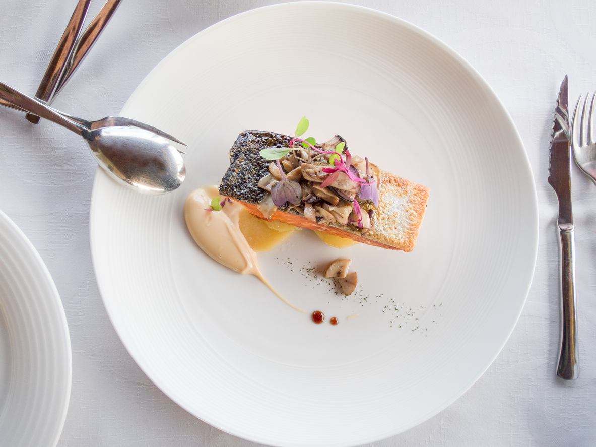
Blank spaces would detract from your attention. You need to be able to identify and focus on the main food item. The first step is therefore making sure that the ingredients add up around the main ingredient.
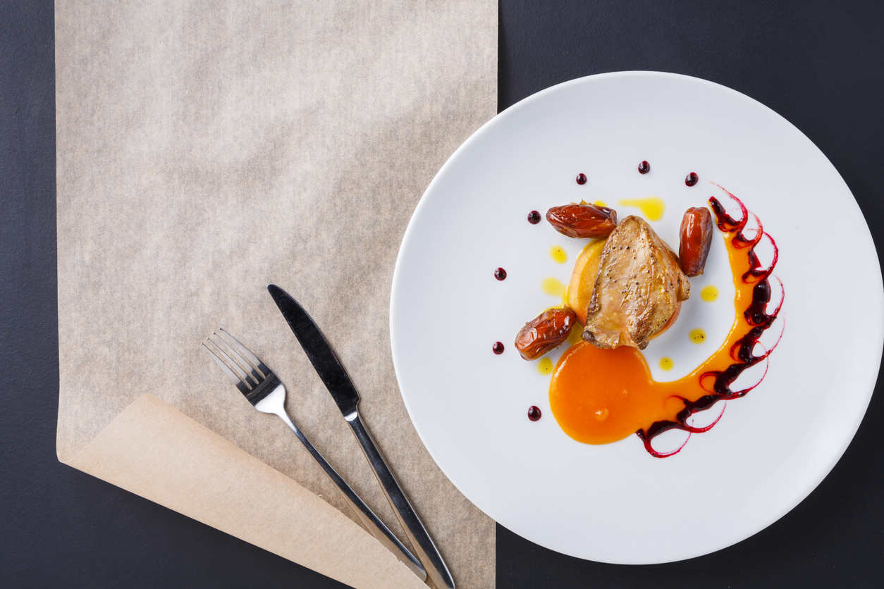
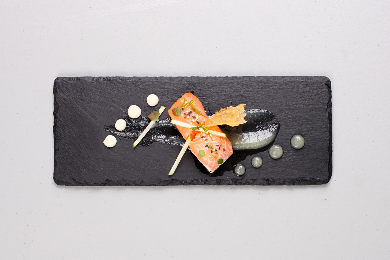
The focal point is where we want our guests to look. In plates where the main ingredient is not something as obvious as a meat cut, for instance, you must consider how the dish flows. What does this mean? It means that your eye follows a certain direction to reach the focal point, there is a visual journey along the dish. Triangular compositions, zigzags, curves and diagonal layouts, among others, achieve this affect.
SEEKING BALANCE THROUGH THE BEST LAYOUT
When I speak of unity, by no way do I mean piling up everything. In other words, we don’t want a cluttered formation with the dressing and sauce piled up right by the fish. Everything must be balanced harmoniously. This is achieved through the layout of the food on the dish, also playing with texture and color.
Layout is something I’ll get into with greater detail later on–it is an art form in itself. Cross-cutting, with curved lines, horizontal, the rule of two thirds, scaled, asymmetric, triangular, rhythmical, symmetrical… There are many different approaches and I will provide details in forthcoming posts.
COLORS MATTER
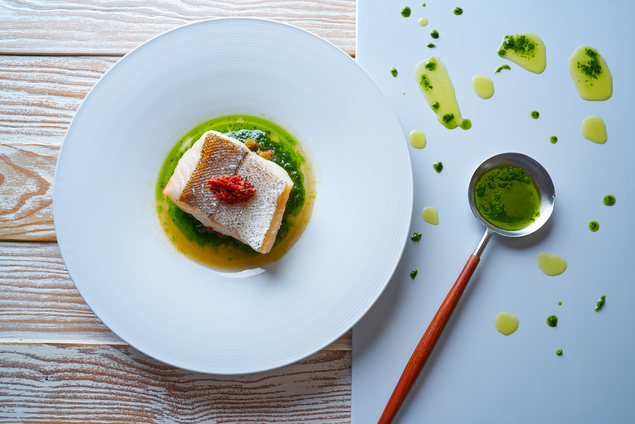
The food colors on the dish add harmony and give information on the type of food (for instance, you won’t find green meat). So what I’m seeking is a natural, lively appearance, incorporating red foods to brighten your perception.
Another trick I use is the chromatic wheel. Picture an analog clock that instead of moving from 12 to 1 shifts from yellow to dark blue, passing through orange, red and green hues in between. This is a good way to arrange your food on the dish.
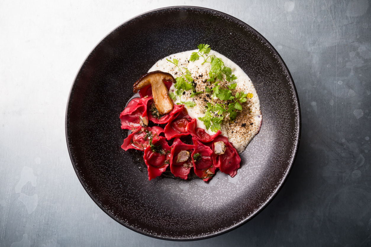
Another more complex approach is playing with a single color. Working around a single tone is a very powerful challenge. And you must bear in mind whether the color of the dish itself contrasts with that of the ingredients.
A VERTICAL LAYOUT
It’s funny how one of the approaches to laying out food on a dish leads me to Tuscany, specifically to San Gimignano. Here you can see what I mean:
And here is San Gimignano:
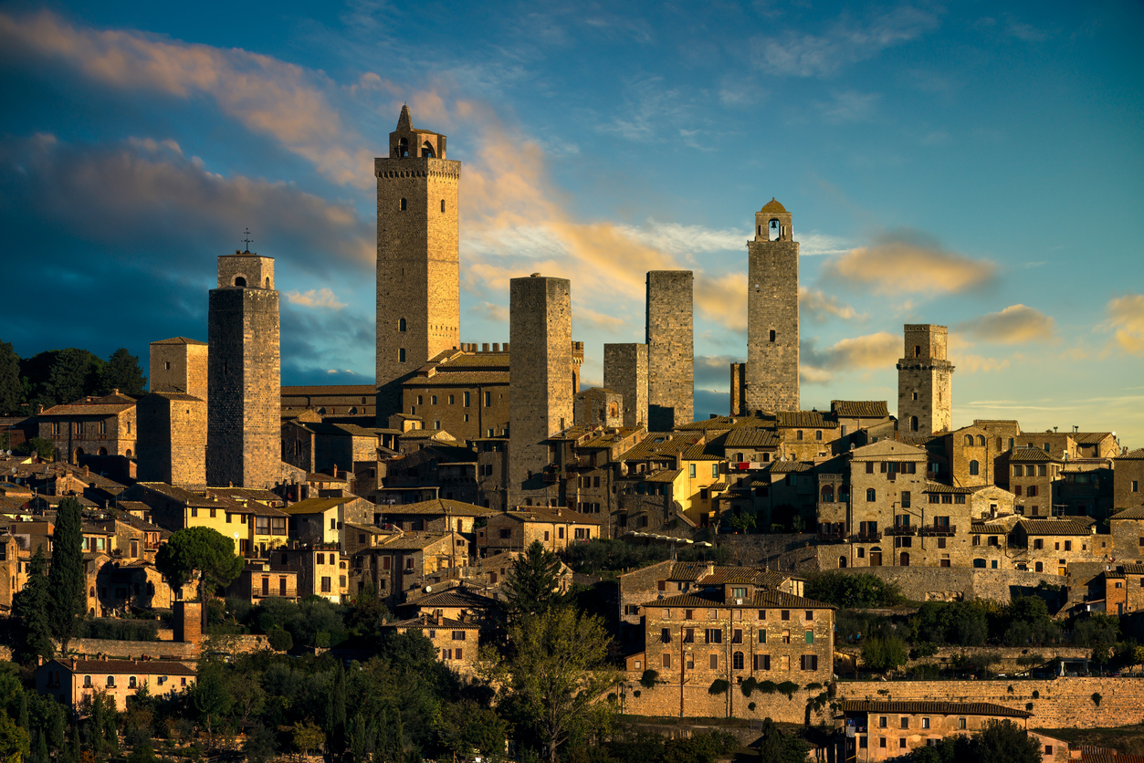
Following this brief excursus (the love of Tuscany always pops up), it’s back to the kitchen. In dishes with a linear or horizontal layout this is always a highly elegant trick. We add volume by placing some of the ingredients standing up, so to say, something you can do with leaves, edible flowers or shoots. Use tongs to place these ingredients on the dish. It’s not always easy to do.
TEXTURES ARE IMPORTANT, AND NOT ONLY ON YOUR PALATE
It is very appealing to play around with textures. It is essential to make a recipe more palatable, but also when laying out the food on the dish. Remember, you do get to feed your eyes. Some ingredients are accompanied by a thick sauce, but why not draw out a tear on the dish? Or how about shaping it like a brush?
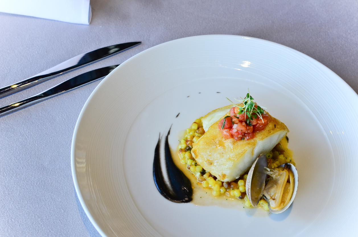
As you can see, there are many different things to consider when laying out food on a dish after cooking. Basic knowledge and a creative mind can make for a delightful presentation for your guests. If when placing the dishes on the table your guests take out their cell phones to take pictures, that makes you a star. Never be afraid to be creative!
